Home  Script Language I/O Functions Dialogs CreateDialog Script Language I/O Functions Dialogs CreateDialog |
||||||||||||
See also: ConfigDlgComponent, ShowDialog
 |
||||||||||||
  |
||||||||||||
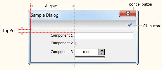
CreateDialog |
 |
|||||||||||
|
|
||||||||||||
| Home Script Language I/O Functions Dialogs CreateDialog |
||||||||||||
| See also: ConfigDlgComponent, ShowDialog
|
||||||||||||
|
||||||||||||
CreateDialog |
|
|||||||||||
|
|
||||||||||||